Name: TOPDANMARK APP
Type: APP DESIGN
Role: EXPERIENCE LEAD
Duration: FALL2021 - SPRING2022
Executive summary
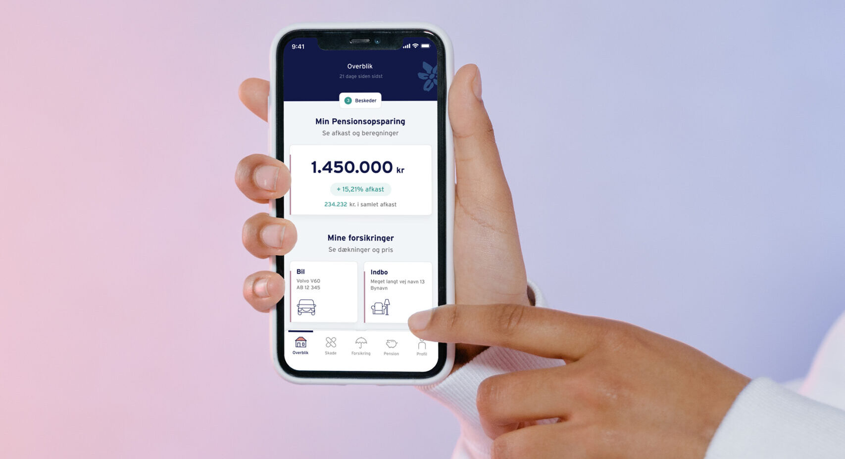
As the design lead, I spearheaded the design and conceptualization of Topdanmark's first mobile app for its customers. Since Topdanmark didn’t previously offer a mobile application, my task was to demonstrate how an app could benefit both customers and the business. The goal was to visualize a digital experience that optimized processes, enhanced customer engagement, and strengthened Topdanmark’s role as a trusted insurance partner.
Design challenge
Topdanmark, which didn’t yet have a mobile app, wanted to explore how such an app could benefit its customers and support business processes. The key challange was to enhance customer engagement by making it easier for users to understand and get more out of their insurance products, ultimately positioning Topdanmark as a trusted insurance partner. Additionally, a second challenge was identifying how mobile functionalities could provide convenient, self-service options for customers, such as reporting car damage and documenting incidents in real-time.
Design solution
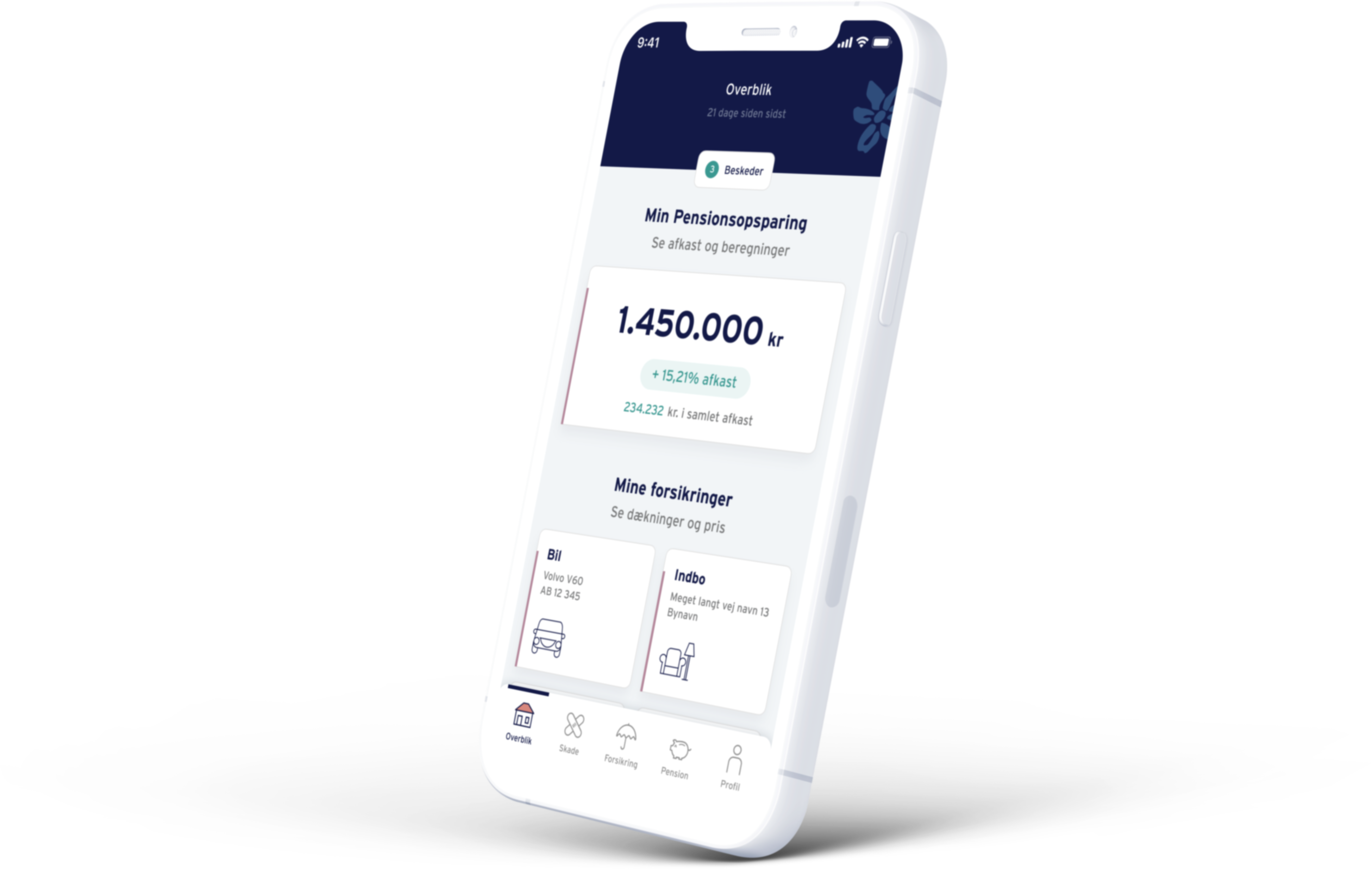
The solution was a mobile app that united Topdanmark’s two business areas - pension and insurance - into a seamless digital experience. The app also addressed common customer pain points (like payment understanding) and informed them about untapped insurance benefits. Key features included:
OVERVIEW
Glanse and go
A streamlined overview of customers’ insurance and pension details, including coverage, savings, recurring payments, and investment performance, providing an at-a-glance view to keep customers informed and in control.
Profile
Personalizing insurance
Customers could add personal information about household members, vehicles, and pets. This enabled Topdanmark to tailor recommendations and offer a more customized insurance experience that covered all their needs - known and unknown.

PAYMENT OVERVIEW
The small numbers
Insurance payments can vary monthly due to yearly fees and government-imposed costs, which are often confusing for customers. The payment overview feature provided clarity, helping customers easily understand their bills.
THIRD-PARTY SERVICES
Making Perks Visible
Topdanmark offers value-added services with certain policies, like online medical help and water leak detectors, but many customers weren’t aware of these perks. The app highlighted these services, helping customers make the most of their insurance plans.
Process / Impact
I collaborated closely with a cross-functional team comprising business analysts, product owners, developers, and other designers. To thoroughly understand customer and business needs, we consulted with different departments, including customer service and product teams, identifying key pain points and opportunities. Throughout the design process, we engaged customers in usability testing to ensure the app met their needs and expectations.
This case demonstrates how I applied user-centered design to address both customer needs and business objectives, ultimately creating a well-rounded solution that introduced Topdanmark to the mobile app space with a valuable, user-friendly tool.
Other projects

Behaviour typesUser Research
Onboard non-investorsDigital Strategy
Topdanmark AppApp Design
Flow - connecting fast money and slow moneyDigital Strategy
Nordea MobileApp Design