Task: Nordea Mobile
Type: App Design
Role: UX Designer + Experience Lead
Duration: FALL 2017 - SUMMER 2021
SUMMARY
Design lead for developing and maintaining the savings and investment experience in Nordea's mobile app. This ongoing process includes reflecting the business strategy in the app, converting early designs into tangible concepts, and designing user-friendly flows.


Making the savings and investment area relevant and accessible for the customers who don't have a deep investment knowledge and want to stay on top of their long-term finances without spending hours on understanding the subject.

Provide a simple overview and at the same time make handling of long-term savings quickly and effectively without too much personal effort.

OVERVIEW
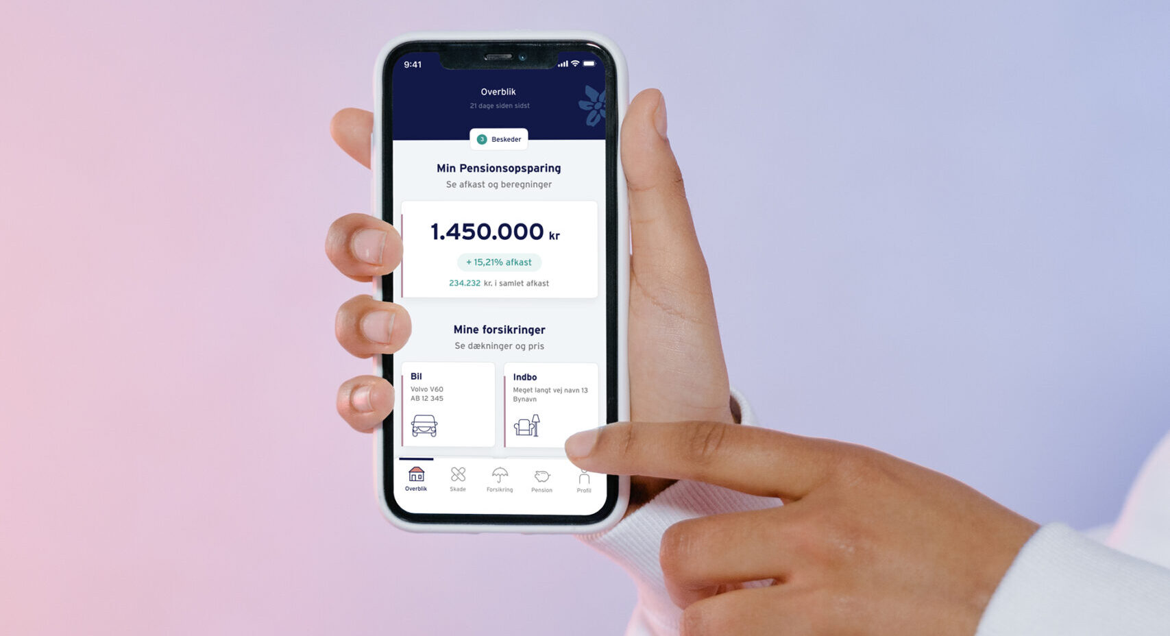
GLANCE AND GO
The overview screen highlights the numbers that are important for you so you can be in control of your long-term savings without being an expert.
DATA SWITCH
NO OVERLOAD
Investments contain a pretty big load of data. Data switch keeps the experience clean and straightforward while all data is still accessible.

EMPTY STAGE
GET STARTED
Utilizing the empty stage to help users without any deep investment experience to see their investment potential in a simple click.
SEARCH & INSPIRATION
STEP-BY-STEP
The search covers the needs and wants of the users by supporting them in finding what they are looking for - regardless of their level.


Nordea follows the SAFe Agile Framework when developing and maintaining digital platforms. The difference between working in an ordinary Scrum team and SAFe is that every Scrum team is part of an Agile Release Train (ART). Every 10 weeks there is Program Increment (PI) planning, an event that serves as the heartbeat of the ART, aligning all the teams on the ART to a shared mission and vision. During the PI planning, the teams discuss which features will be delivered based on the biggest value for the end-user and commit to delivering a set of features until the next PI planning.
In SAFe the UX designer can either be part of a specific team, an ART, or a Shared Service. In Nordea, the UX discipline is a support service in each ART. My role as a UX designer was to support a couple of development teams within the ART together with other UX colleagues.
Our aim for the UX discipline within the SAFe Agile Framework was to be a couple of steps ahead of the development and business strategy. The purpose of being ahead was two-sided; to have an impact on the selection of features and to create the best possible designs.
Other projects

Behaviour typesUser Research

Savings GoalsConcept Development

Flow - connecting fast money and slow moneyDigital Strategy
Onboard non-investorsDigital Strategy
Topdanmark AppApp Design

Nordea Online BankingWeb Design

Automated savingsConcept development